
Christmas Brand Book for Wayfair EU.
A concept for the campaign along with the toolkit that expands across 3 months of the festive season.
A concept for the campaign along with the toolkit that expands across 3 months of the festive season.
Concept note: When you’re young, Christmas is a magical time of year. When you’re older, it’s not as easy to maintain that festive feeling. Preparing for what should be a joyful time can involve queues, gift ideas out of stock and time pressure. You could say that Christmas can become a source of anxiety, not a source of fun...so that’s where Wayfair’s comes in. By making sure that prepping for Christmas is stress-free, that festive feeling doesn’t have to kick in on the 24th of December – it’s something you can enjoy from the get-go! So in the early phases we want to dial up the magic in a big way. No need to wait until December – simply click and get shopping, all without leaving the comfort of home, the home you’re going to make magical this season.
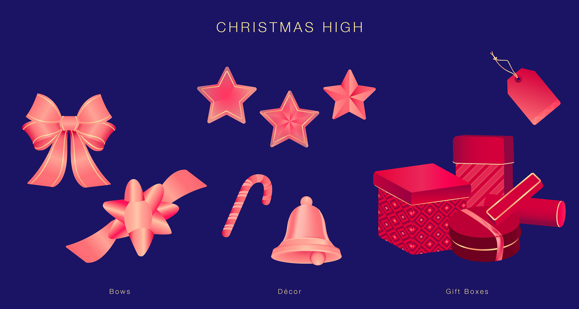
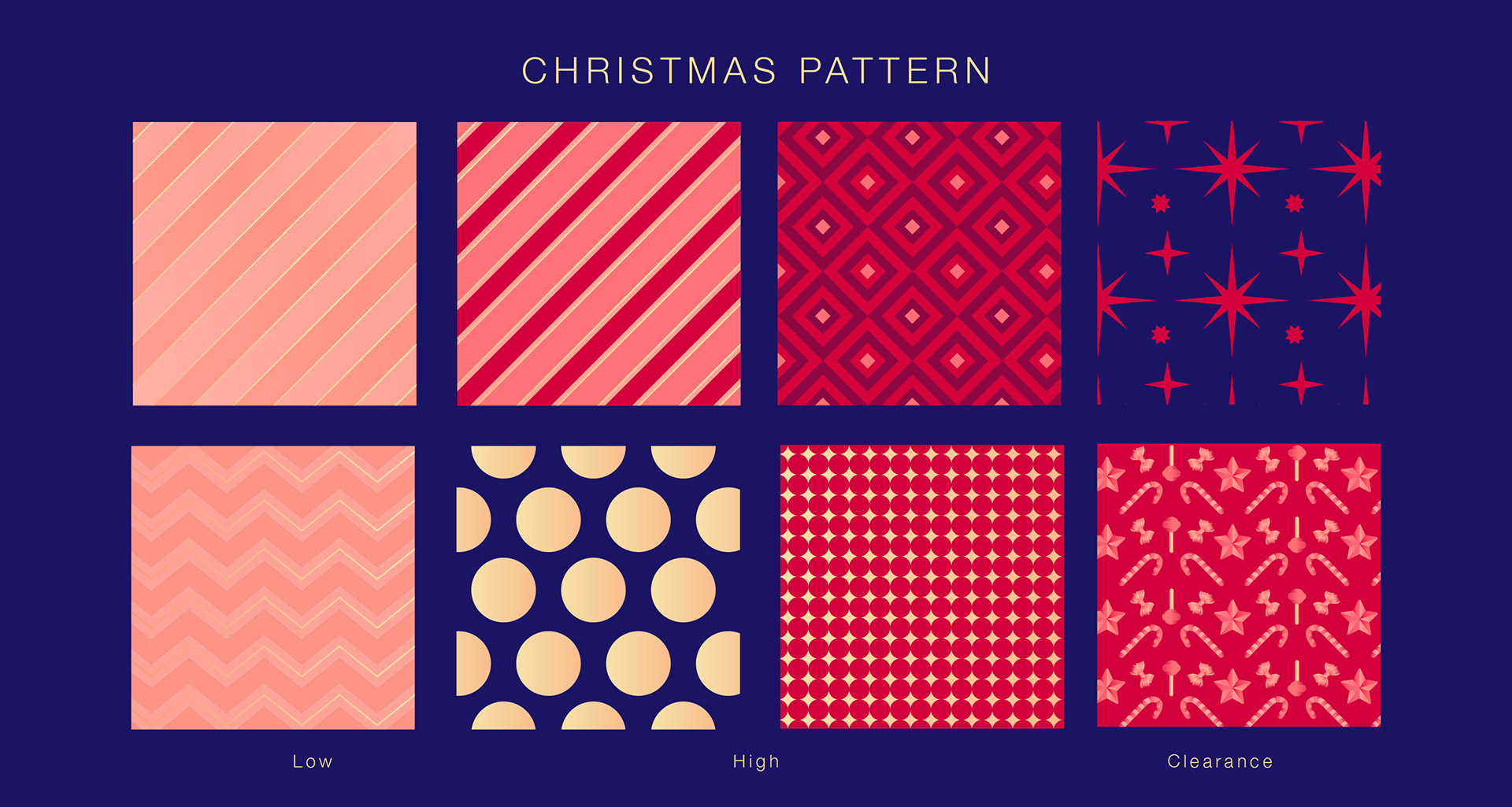
Graphics: Launching the season with wintery elements still honing into the idea of magic. The treatment is glow using light & shadows and gradients to give more 3D touch. In the process created depth when they are used with imagery and copy. Then transitioning into recognisable Gifting elements when one is prepping for the guests. For the last stretch of the season, its an explosion of emotions, the excitement resonating with the clearance sale and Boxing Day. The gift wrapper patterns get intricate and are used as a background and within the elements. Offering, multiple possibilities with the toolkit to sustain for 3 months.
Colour Palette: The primary colour palette gradually increases in saturation from peach to deep red, as the day get closer. The secondary colour is the Wayfair brand purple, tying the campaign back to the brand. And the accents provide enough contrast for the text and CTAs against the warm colour palette.
Colour Palette: The primary colour palette gradually increases in saturation from peach to deep red, as the day get closer. The secondary colour is the Wayfair brand purple, tying the campaign back to the brand. And the accents provide enough contrast for the text and CTAs against the warm colour palette.


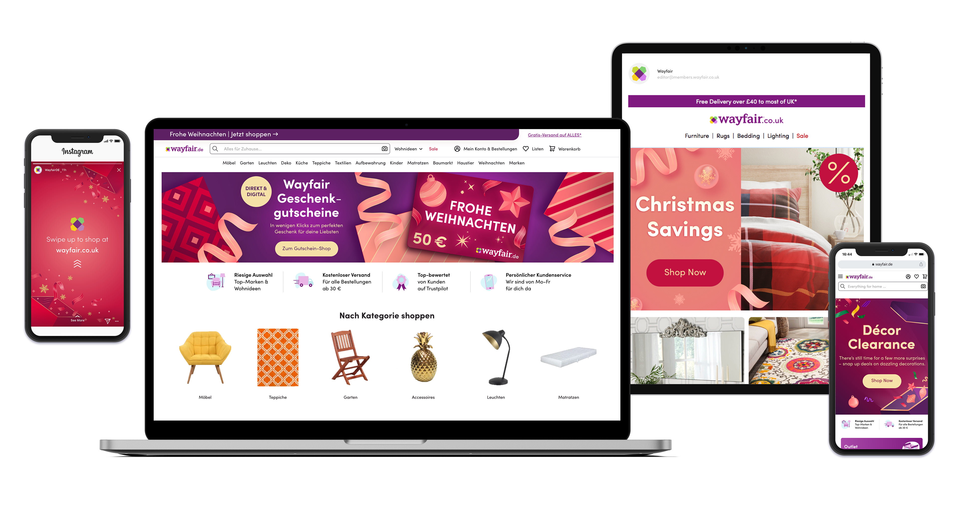
These are the assets created for various marketing channels across the season using the above toolkit.